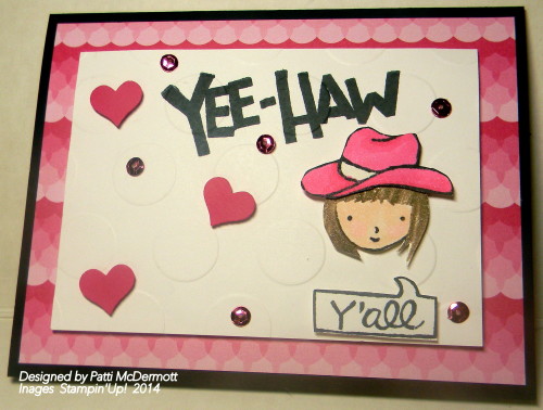
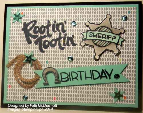
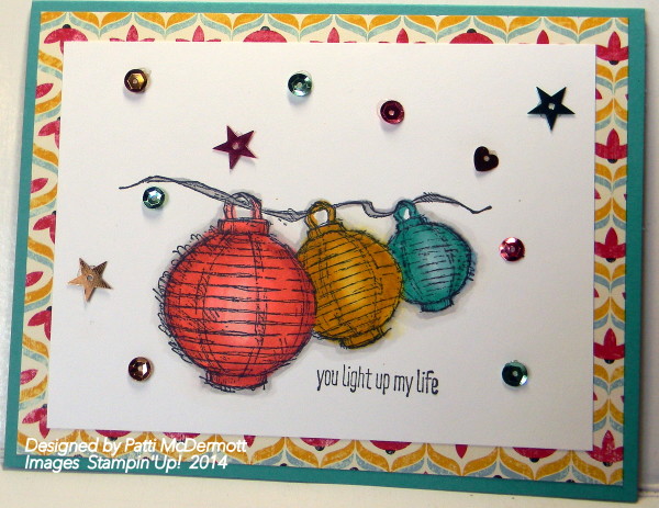
I love using our new sequins with the cards I create. It adds another dimension, don’t you agree? You can find the sequins on page 208 in the Big catalog. I used the end piece from the burlap ribbon for the rope. In addition, I used the DSP Confetti Celebration found on page 186.
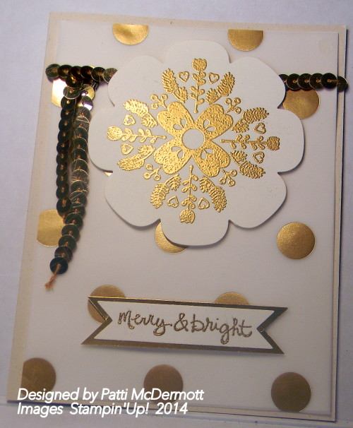
I sure used a lot of Glam on this card. Gold embossing, gold sequin trim along with the gold Fancy Foil DSP Vellum, gold foil card stock and metallic Gold card stock for the base card. WOW that’s a lot of GOLD!
The Stamp set is Cheerful Christmas found on page 15 of the Holiday catalog and the sentiment is from Endless Wishes on page 32. Do you remember last Christmas that Endless Wishes sold out in a matter of days. Well it was so popular that SU decided to bring it back and I am so glad they did. It is an awesome stamp set with beautiful fonts and images.
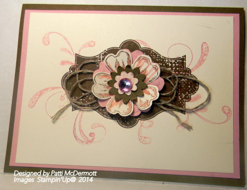
I rec’d this card as a swap from Laura Fernsler and I just loved it. I do not own the stamp that she used for the back ground which was Flowering Flourishes so I substituted Everything Eleanor for my background. We made this card at my hostess appreciation party and everyone loved it. Thanks to Laura for her inspiration!
Ok you are wondering “How come Melon Mambo for Christmas” right? Well, I just wanted to switch it up a bit and also remind those of you that have not signed up for my class this Saturday, you still have time. Deadline is Thursday!
I water colored this with aqua painters using Melon Mambo, and Old Olive on water color paper. In addition, I used the white gel pen for effects. The sentiment is from the Project Life set, Holiday Cheer, found on page 35 of the Holiday catalog.
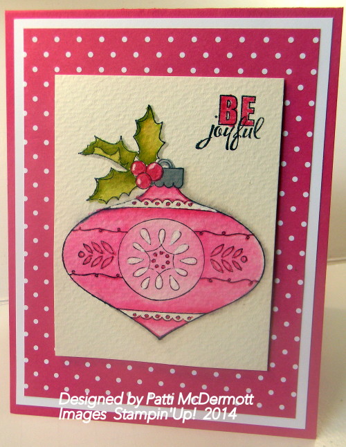
One of the perks of using Stampin’Up!© products is that our catalogs are loaded with ideas. For example, I cased this directly from page 47 in the Holiday Catalog. So easy and so much fun. A real no brainer! You can start ordering from this catalog on the 28th and I have heard from y’all that you have already rec’d yours in the mail. Don’t you agree it is the best Holiday catty yet?
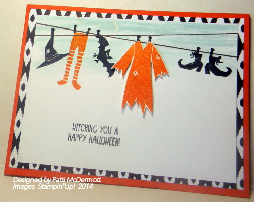
Most of you have rec’d your new Holiday catalog and I am sure you are loving it! This card was created with the set White Christmas. I used both the white gel pen and the chalk marker on Night of Navy card stock. I colored the card and tree after I applied the white chalk. No embossing was used on this card.
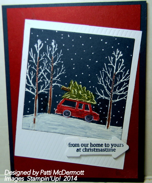
It is really hard to tell by this picture, because I couldn’t get the camera to cooperate, but the colors are Lost Lagoon, Pear Pizzazz and Soft Sky. I colored the Glimmer paper with Pear Pizzazz but it looks darker in the picture that it really is. I also used the new beautiful Lost Lagoon silky taffeta ribbon. This is one of those cards you need to see in person. I used the sentiment from Endless Wishes and cut out the tree with our new Tree punch.
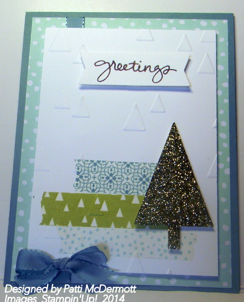
Are you thinking that you want to beat the rush this Holiday season, get your cards done early and out of the way so all you have to do is put the stamp on the envelope and shoot it in the mail box? Well, you can if you attend my Class on Sunday, the 30th of August. We will be making 5 different cards to get you started. We have the most beautiful stamps in this year’s Holiday catalog. If you are a regular you will be receiving one in the mail very shortly. If not, contact me here to get one. Registration required and seating is limited.
I will be posting some Christmas cards, in the following 2 weeks, before the class, so you can get an idea of some of the stamps we will be using (not necessarily the cards we will be making, but definitely some of the stamps).
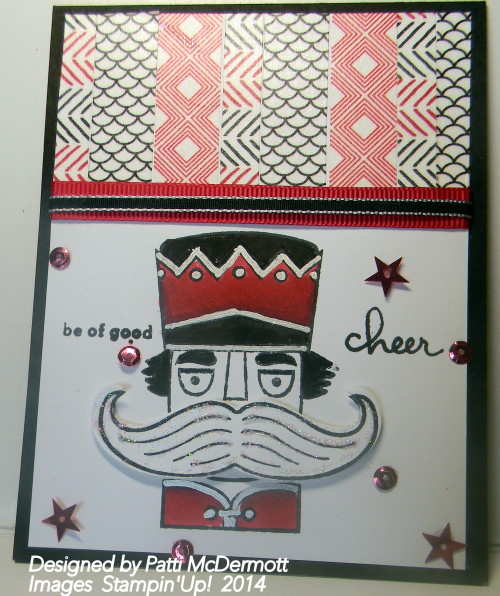
You will be able to purchase this stamp set on August 28th, the first day that you can order from the new Holiday catalog. Wait till you see that catalog. It just blew me away and you will be receiving yours soon.
I had all I could do NOT to order everything in it during the pre-order period for demos. Of course, I did purchase some of them available at convention so I really had a head start to get used to them. If you like the set “Work of Art”, you will love this. I cased this card and envelope, directly from the magazine called “Stamping Success” that is for Demonstrators only.
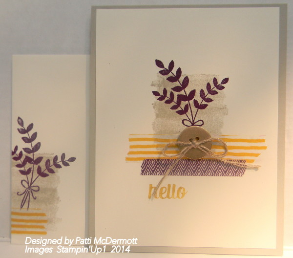
This is one of the cards we will be making at the hostess appreciation party. That is a fun event that I have for all the wonderful Hostesses that have held parties at their homes, did a book party, were a regular member of one of my clubs, or is an active Paper Pumpkin subscriber for the last year (current year starts all over in August this year).
This is a blast and we have the best time. Free prizes, food & beverages, make & takes and everyone going home with something fun. If you would like to be included next year, you can host a workshop in your home, or qualify for any of the ways above to earn an invitation. We would love to have you.
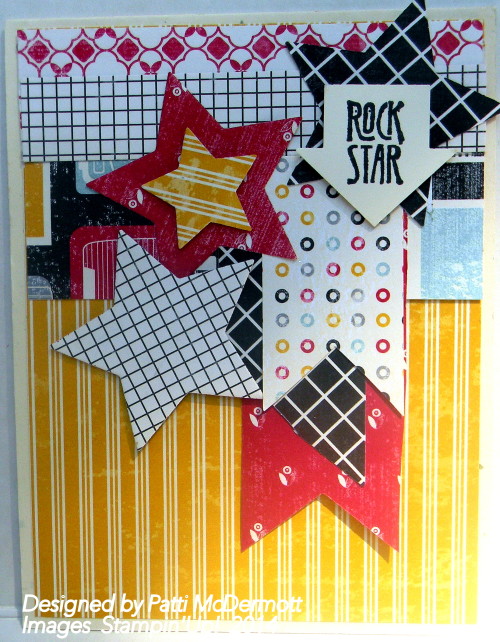
I told you before that I will I am going to use the heck out of this set “Pictogram Punches” and I am doing a good job of it. On this card I also used a new set called Chalk Lines found on page 114 of the big catalog. This is one of those stamps (like Bordering Blooms pg 162) that have pretty much replaced the wheels we used to have. They are so much more easier to line up that the wheels and I love them. I water colored Shimmery card stock with Pacific Point & Tempting Turquoise inks and used the new framelits to cut out the stars. Hope you like it!
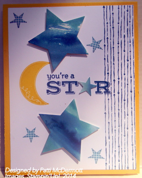
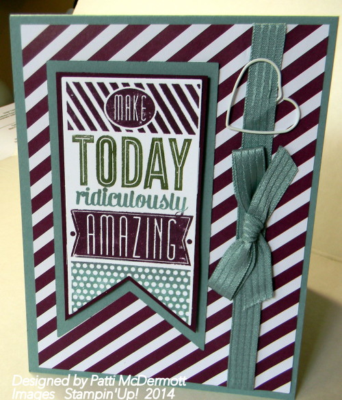
This is one of those cards I like to call easy peasy, not exactly CAS (clean and simple) but close. We made this at Wednesday’s club and every one really liked it. They all thought it would be a great masculine card also. I used our new in-colors, Mossy Meadow, Blackberry Bliss and Lost Lagoon. Notice the Lost Lagoon satin ribbon which comes in all of our new in-colors. So pretty and lays so nicely on your projects. I used the banner framelits with the Big shot.
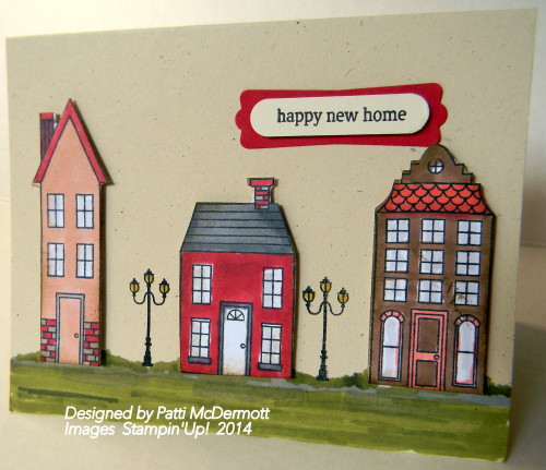
This set is called Holiday Home and it is in the new (yet to be released) Holiday catalog. You will soon be getting it in the mail and every thing in there will be available for purchase on August 28th. This goes well with our Nordic Noel DSP AND….are you ready for this…….. matching Framelits to cut out the houses. This is so much fun to play with. Another perk is the fact that you can save 15% by purchasing the bundle (both the set and the framelits) together.
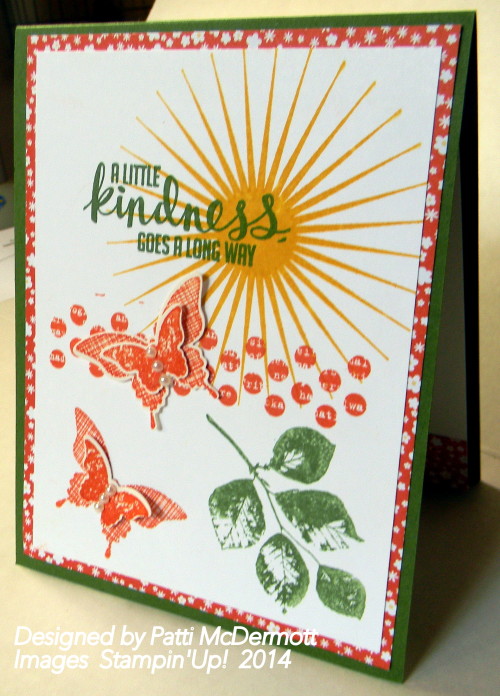
Another card created with the set Kinda Eclectic. This is turning out to be one of my faves. On this card, I used every image in the set. The colors I used were Garden Green, Crushed Curry and Tangerine Tango. O used our punches to cut out the butterflies. Hope you like it. This set can be found on page 164 of the big catalog. If you haven’t received your copy of the catalog yet contact me HERE.
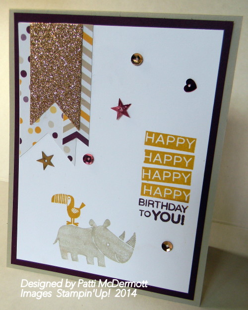
This is one of the cards we made at class on Wednesday. The sentiment is from the set Amazing Birthday found on page 48 of the big catalog. It is so versatile and many of the sentiments are great for masculine cards. All of the sentiments can be cut out with either framelits with the Big Shot or with our punches. Great set. I used our new In color sequin assortment on this card in addition to the glitter paper. The other images are from the set Zoo Babies.
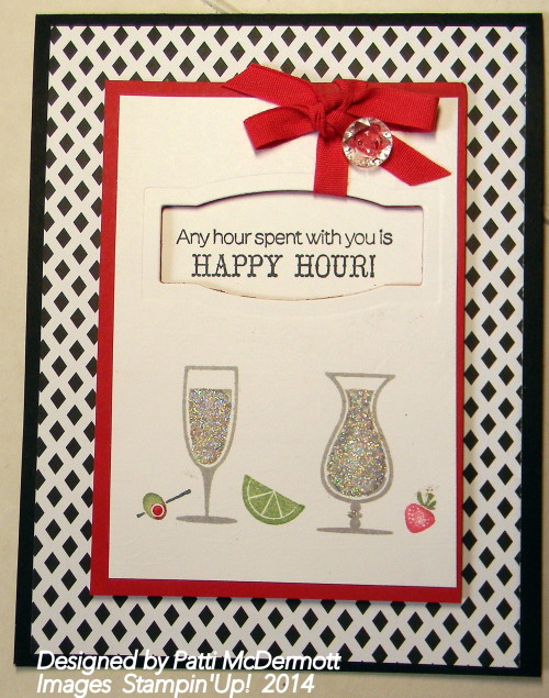
I haven’t used this set in such a long time. A swap I rec’d at convention inspired me to try to create something with it and this is what I came up with. The set is called Happy Hour can be used for the Holidays also. It contains 5 different sentiments which is a big plus for doing both the front and inside of the card. Not to mention, lots of cocktail glasses! You can find this set on page 135 in the big catalog.
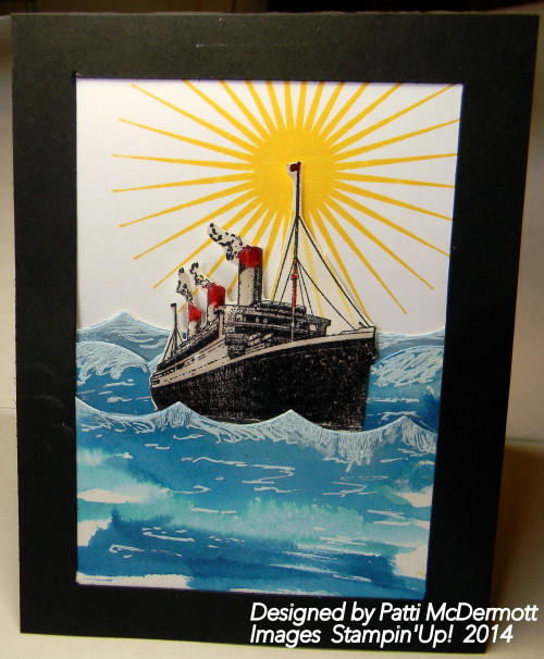
I finally bit the bullet and ordered this set. AND I love it! There are so many samples on the internet for the images in this set. Being used for both cards and scrapping. I used the set Kinda Eclectic for the sun and used crystal effects for the ship. I used the watercolor technique on shimmery card stock for the sea mixing Pacific Point and Tempting Turquoise inks and the white gel pen. I also mounted the waves and ship on dimensionals. Fun to create!
I was extremely proud and honored to have this card posted in Splitcoaststampers’ gallery as the SU Thumbnail.
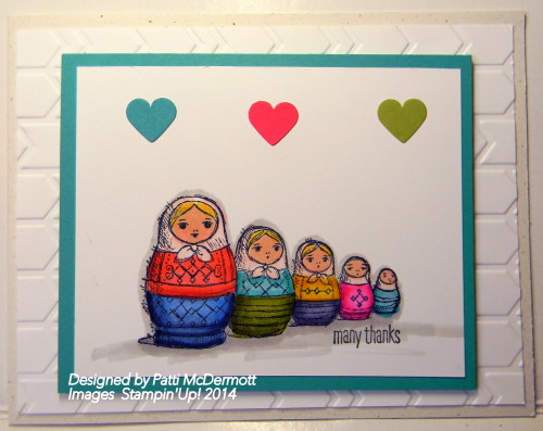
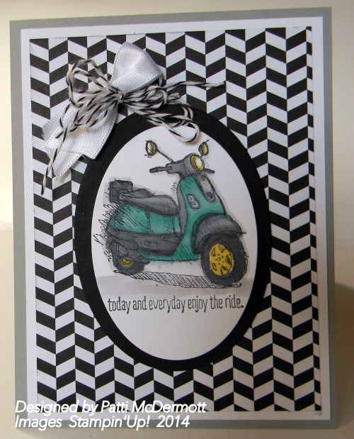
I used the blendabilities on this image from the Today and Every Day set. This set is so stinkin cute! I tried to use a rainbow of colors to show off the depth and brilliance of blendabilities. I am very happy with them (I am a long time Copic user) and the only thing I do not like about them is that they are not refillable. However, when we went to convention, the product manager in charge of blendabilites said they were looking into that.
Right now to make them more affordable for everyone they are not refillable. If enough people like them and ask for it, even though they may cost a bit more, they may just decide to make them refillable. Hint, hint……
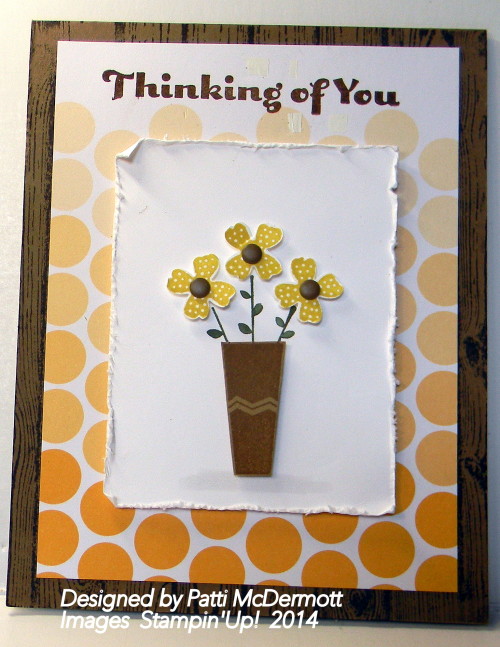
Can you guess what I used for the background on this card? Well, it is from Project life. It is one of the cards in the set Everyday Adventure on page 189. I love the ombre look and the nice thing about these PL cards is that you can use them on greeting cards as well as your memory books. Lots of designs to choose from. I especially love this stamp set and try to use it as much as possible because it is so easy to create with it.
This image is from the set Today and Every Day” found on page 168 of the big catalog. I used the new black & white bakers twine with the new white satin ribbon and colored the image in with Blendabilities. The DSP is Back to Black also found in the big catalog. I am very happy with the way this turned out. What do you think?
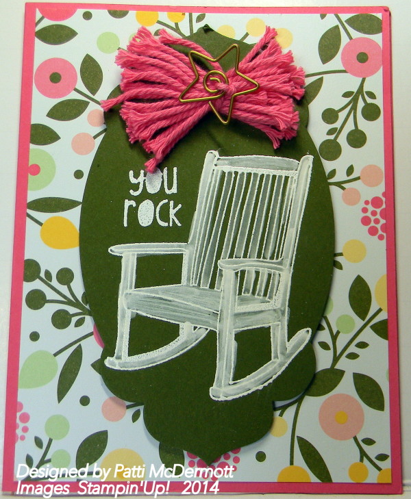
This is one of the single stamps that SU is featuring in the Big catalog. I embossed it in white craft ink and then colored it in with our White Stampin’ Chalk Marker found on page 211 in the big catalog. I think it gives it a realistic look! I used the Basic Hodgpodge Clips on page 209 and the Strawberry Slush Thick bakers twine. The DSP is from the All Abloom paper stack.
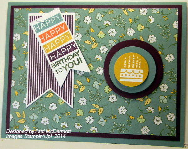
This set called ‘Amazing Birthday’ is another set that we got FREE at convention. It is so versatile. You can use either punches or framelits with this card. I love the sentiments. If you are one of those crafters that surf the net for ideas, then I am sure you have seen a ton of cards made with this set. The DSP is from All Abloom paper stacks found on page 185.
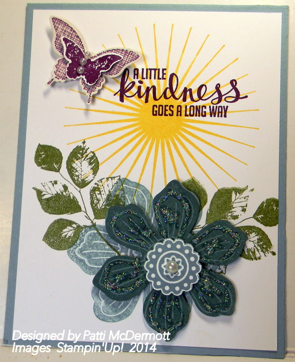
I wanted to purchase this set right from the beginning but I knew it was one of the sets that SU was giving us FREE at convention so I held off. I have seen so many beautiful cards made with this set. You can find it on page 164 in the big catalog. I used Dazzling Details on the flower and punches on both the butterfly and flower. Great set!
I love this stamp set call ‘Today & Everyday” found on page 168 in the big catalog. It is a great set to use your Blendabilities on. In fact, at convention, SU used this exact image to show Demos how to use the blendabilities. Mo, who wasn’t that enthused with them, after using them at convention with this stamp, she now loves them. As I have said before, there is a bit of a learning curve using them but once you do, it is awesome. The DSP I used on this card is Flashback.
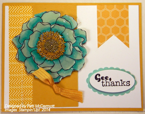
I used crystal effects on this flower after I colored it with the Blendabilites. I really like the way it came out. This is another single stamp called Blended Bloom and can be found on page 167 in the catalog. This is a great stamp for learninghow to use the blendabilities. I also used the new washi tape Beach House found on page 190. So many beautiful things in the catalog. If you don’t have a catalog and want one, contact me here.
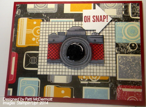
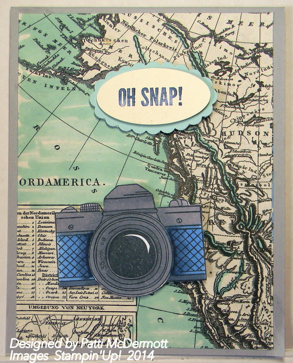
This is another card we made at club meeting. The DSP is the specialty paper ‘Typeset’ on page 184 in the catalog and the stamp is another single called Snapshot! We used blendabilities on the camera. This is one of 5 single stamps that were given to all attendees at convention. I already had one so I swapped this out with Mo an I took hers, she had the rocker that said ‘You Rock”.
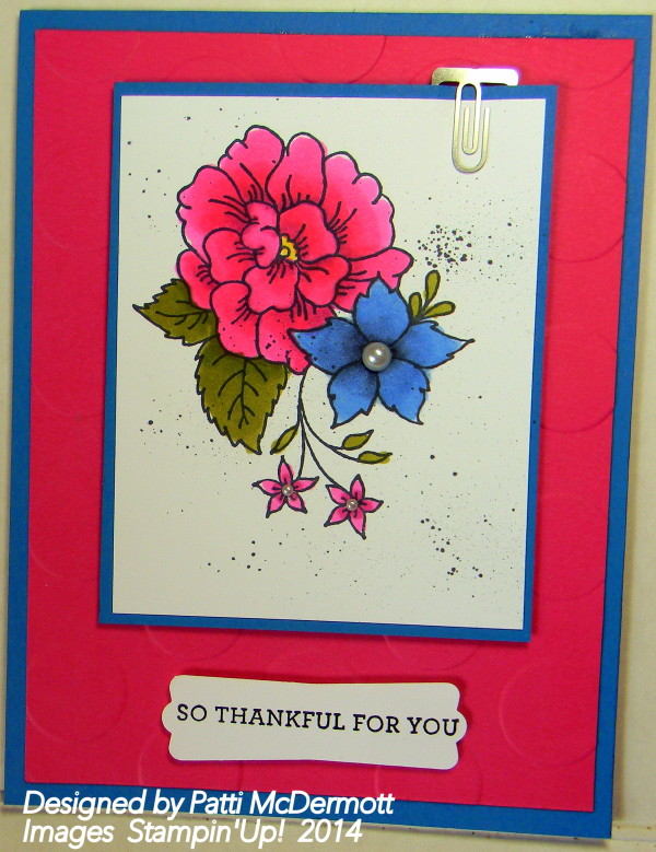
I colored this card with the new blendas that won’t be available to the public until August 1st. The colors I used here are Melon Mambo, Night of Navy, and Old Olive. I did use this card as a swap at convention. I actually had made so many cards for my classes and clubs that I had several 1 only cards to swap. I will be posting some others also.
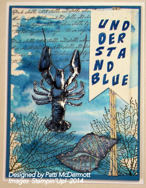
I made this card especially for Lydia. She is the sweetest person and such an artist! She loves the color blue so I did the entire card in blues except for the crystal effects and the glitter. That is also the name of her blog “Understand Blue”.
She did a presentation of techniques at the convention and they were awesome. Lydia lives in Texas.
