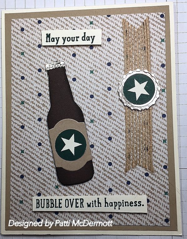
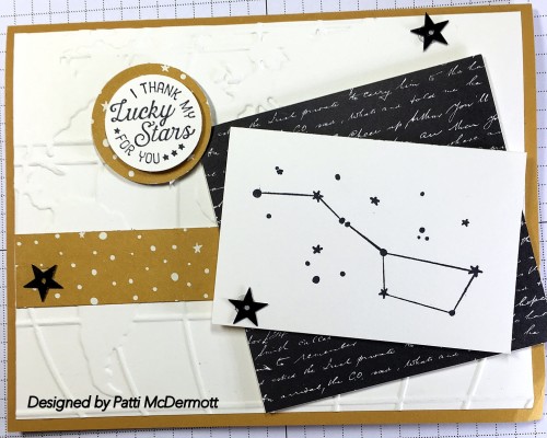
I have already used this set so much. It is so awesome and so versatile. You can find it on pg 32 of the OC. It also has the matching framelits Dies (same page) and if you combine them both you can get a 10% discount on the bundle. It contains 19 dies and is such a fun bundle, I used Early Espresso, silver foil for the bottle caps and burlap ribbon. The DSP is True Gentlemen, pg 45 of the OC. In addition, I used Tranquil Tide for the sentiment and stamping the stars.
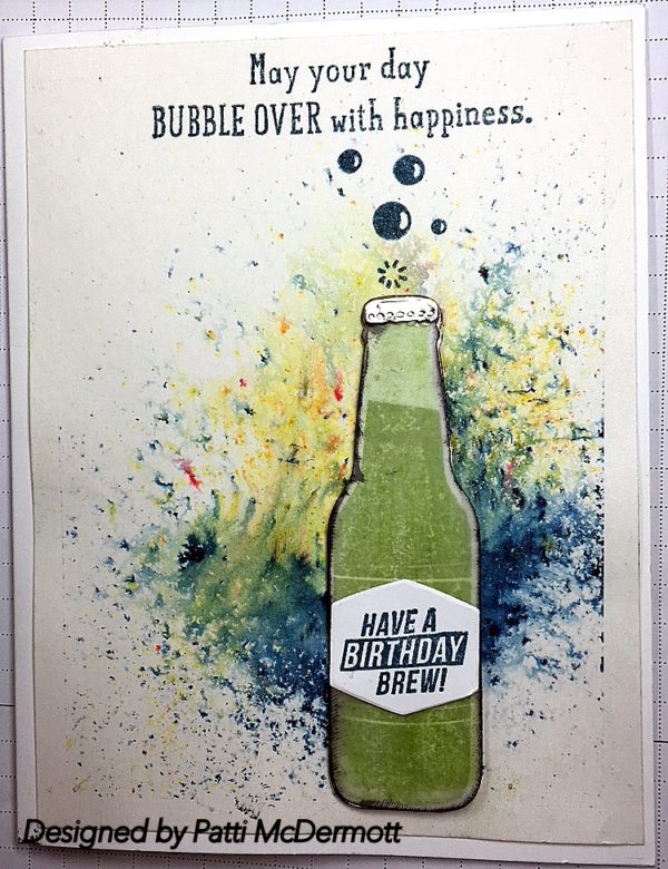
This set, Bubble over, page 32 OC, is so much fun to play with. There are 17 stamps to the set and the Bottles & Bubbles Framelits have 19 dies. You can buy this set as a bundle and get 10% off. I used Shimmery White CS, pg 194 in the AC. I also used Brusho, pg 26 OC, sprinkled on the background and then spritzing it lightly with water. Ink color is Dapper Denim.
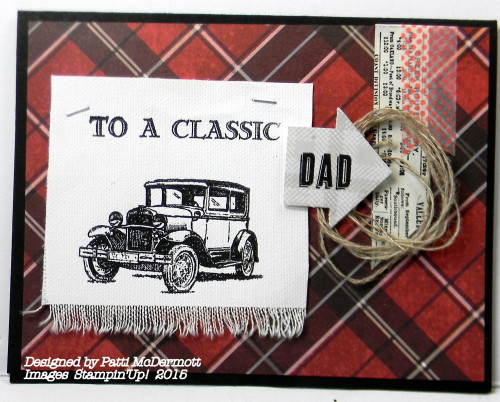
Talk about a masculine card. This set, Truly Tailored, pg 45 of the OC is by far the best choice for man cards. From Birthdays to Father’s Day to just love you Dad days. You can get this set with a discount by purchasing the bundle, set and matching punch same page. AND the DSP is to die for, also on pg 45. You can even fussy cut some of the images out of the DSP and add them as embellishments to your card. So versatile that you will get many uses from this Suite that keeps on giving.
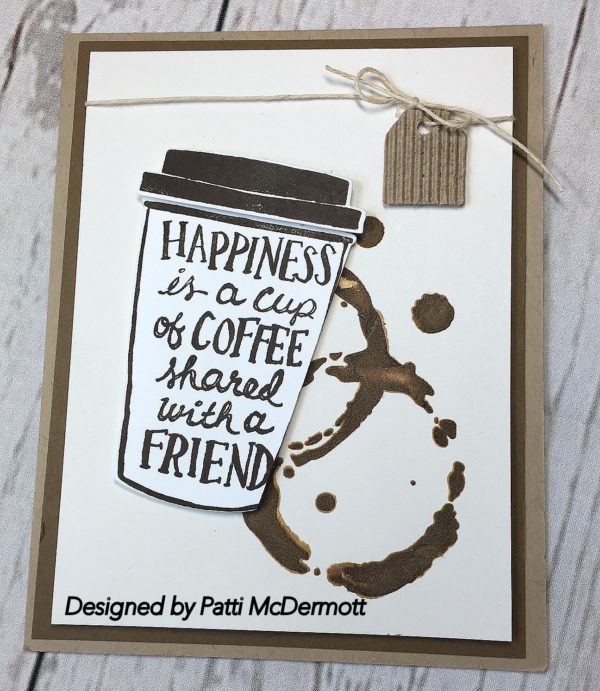
This set is so awesome! You can find this set, Coffee Cafe’ on page 31 of the AC. It has matching dies, Coffee Cups Framelits, page 213, matching DSP, Coffee Break, page188, Corrugated Elements, page 196. It also has a Cardstock pack that matches all the colors in the DSP.
The best part: You can bundle the set and dies and receive a 10% discount. This is going to be a fantastic item for the Holidays. I can see this being used for SB gift cards, etc. The coffee splatter is made with our new Embossing Paste, page 201. I dyed the paste with Soft Suede ink. The stencil, however, is not SU. It is Tim Holz and I have had it a long time for use in my Art journals.
Card stock used is Very Vanilla over Soft Suede and based on Crumb Cake.
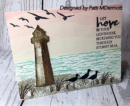
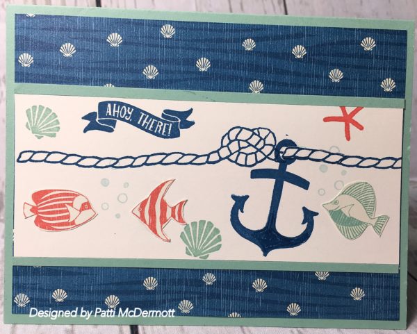
I am so glad that they carried over this set, High Tide, page 25 of the OC. It is one of my favs. Here I used it with the DSP, By the Shore, page 173 AC. This is a very versatile set because it not only has wonderful images, but it has terrific sentiments. Of course, living here by the coast, this set is very special to me. I will get a lot of use out of this set.
I am really disappointed that this set, page 48 of the OC is retiring. As far as I know, the Build it framelits dies have already been sold out. Since this is such an awesome masculine set and it went over so well with just about all of our customers around the world, maybe SU will think of designing another set with matching dies in the future. I am hoping that maybe they will decide to come back with this set. Wouldn’t that be nice. Wishful thinking!
Colors I used were Soft Suede, Smokey Slate and Crumb cake. I added the Urban Underground Embellishments on page 47.
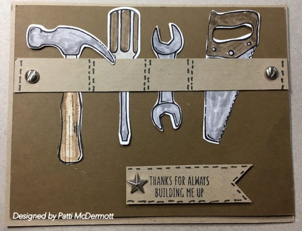
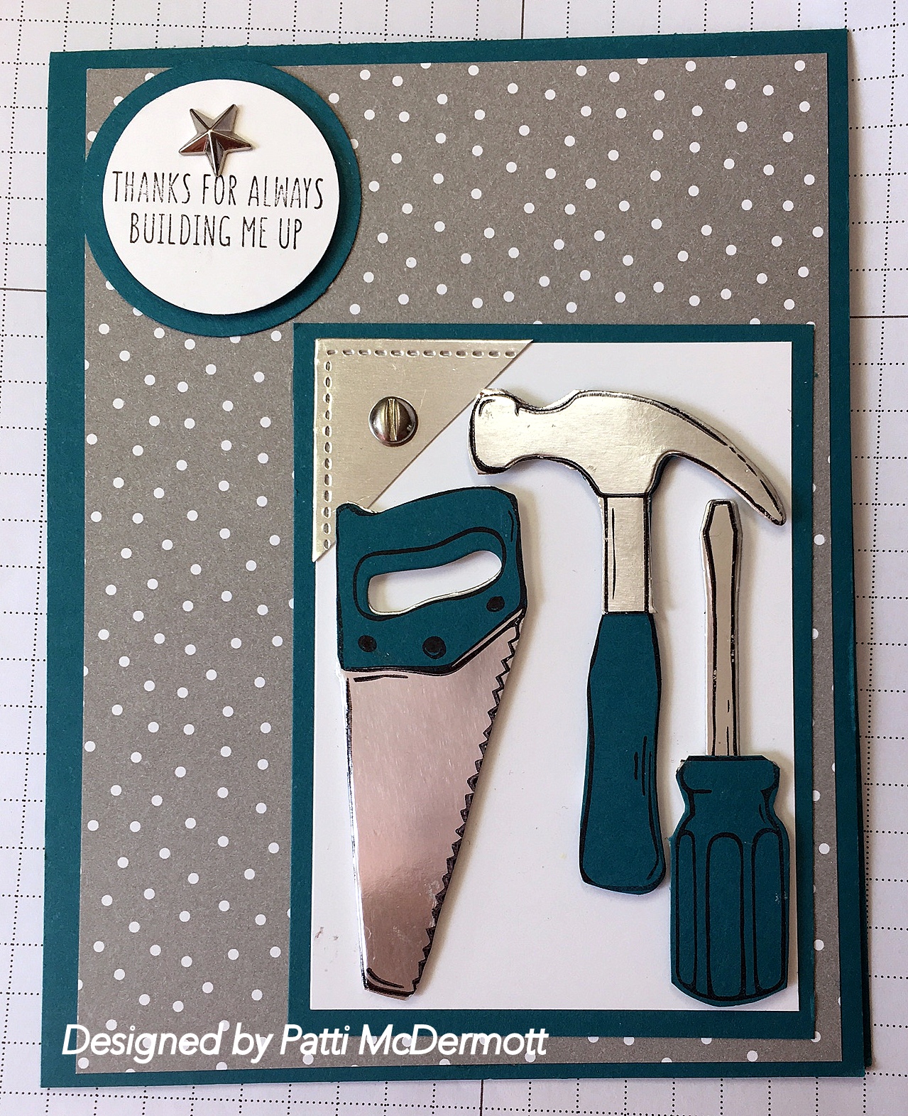
Ok, I am obsessed with this stamp set, Nailed it, page 48, oc. I love the fact that there are die cuts that go with these stamps and I think I have made at least 5 or 6 different cards with them so far. The possibilities are endless. What I love about this set are all the embellishments, washi tape and DSP that you can use with it. These are all listed on page 47 along with the lovely embossing folder, Hexagons Dynamic Textured impressions. In addition, another stamp set in this same catalog, Urban District can also be combined to make dozens of masculine cards for Dad or the men in your life. Save 10% by buying the bundle.

I cased this card from a You Tube video a while back and now I cannot find the name of the person who created it. If any of you out there know who I owe this inspiration to, please let me know so I can give her credit.
Both the dies and stamp set can be purchased together to save a 10% discount. I used silver foil, Island Indigo, and Whisper White Card stock. In addition, I used A little Foxy DSP, page 174 in the AC. The embellishments, Urban Underground, page 47, are from the OC. This is the coolest bundle, I love everything that goes with it. No problem making masculine cards with this set.
I love this set because it is so vintage looking. IN this card I used a monochromatic technique which requires different shades of one color. Here I selected the brown family using Tip Top taupe, crumb cake and soft suede. The image is stamped on Very Vanilla card stock. The set can be found on page 22 of the HC.

Lovely As a Tree, page 130, is such a great stamp set and I hope Shelli keeps her word and NEVER retires this set. I used it here in the background. I masked the truck to add the trees. Stamp set used is Country Livin’ page 131. Colors used are Marina Mist, Crumb Cake, Soft Suede, Early Espresso and Old Olive. The banner is from the stamp set, Birthday Banners, page 15 and the Guy Greetings, page 114. This is great masculine card. You can find the Framelits, Bunch of Banners on page 193.

I wanted to show the gorgeous DSP, By the Shore, page 173, that is meant to partner with this set, Seaside Shore, page 93. You know I love anything to do with the Sea, I live so close to the beach. Again I cut out small images from the 12X12 DSP and added them to the card in addition to the stamped images. Colors I used were Dapper Denim, Flirty Flamingo and Mint Macaron.
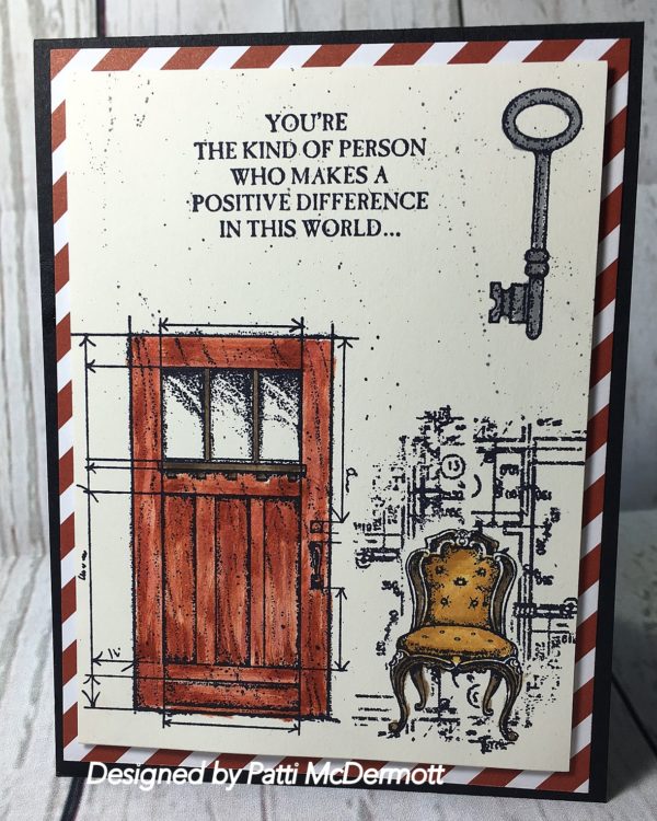
This is one of my favorite sets in the new catalog. In This World, page 145 is so awesome! I have made several cards from this one set so I know you believe what I say. Here I used Delightful Dijon on the Chair and Cajun Craze, Early Espresso on the door. This set has many images that really fit into the vintage style that I am so fond of. As if you didn’t know. The DSP can be found on page 174 and is in the Regal paper stack.
I love this stamp set called All About Everything. If you were a Paper Pumpkin subscriber you would have rec’d this set free, in addition to the regular monthly kit. One of the perks of subscribing. Not to mention the fun you receive every month directly to your home via mail.
The boots are from the set Country Livin’, page 131 and every thing else is from the Everything set. The splatter is from Gorgeous Grunge, page 123.
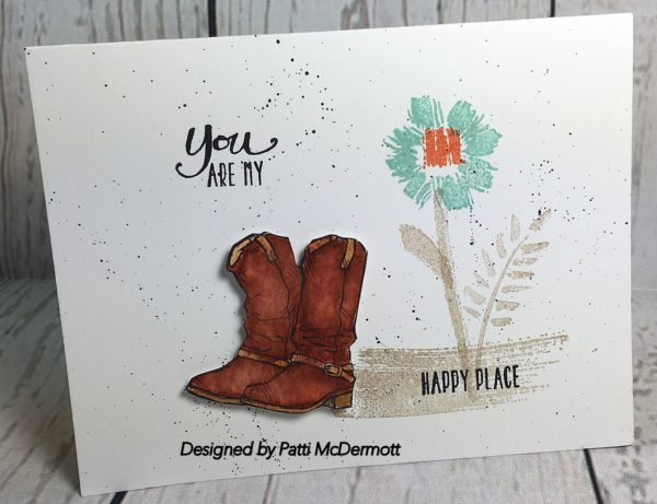
I am in love with this set, Country Livin’, page 131. I used the Background stamp, Hardwood, page 125 in back of these awesome boots and used the set, Timeless Textures, page 120. My colors were Marina Mist, Sahara Sand, Smokey Slate, Crumb cake and soft suede. I used the sentiment from Endless Birthday Wishes, page 22, and the banner framelit, Bunch of Banners, page 193.

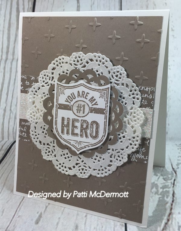
This was one of the cards I created for last Saturday’s Camp. It is so simple yet very elegant and can be used for a masculine card. I embossed the background, Tip Top Taupe, with our new Sparkle Embossing folder, page 195. I used our Neutrals DSP and Dazzling Diamonds glimmer sheets, page 175, In color Doilies, page 175 and Delicate white Doilies, same page. The Stamped image is from our awesome Ronald McDonald House set for this year, My Hero. I used the punch, Best Badge, page 186 to cut out the image.
For every set sold, My Hero, a donation of $3 is donated to the RMHC. Great buy and great cause. We have contributed more than $1.5 million dollars to local chapters. This set is so versatile that making it part of your collection is a no brainer!
 op
op
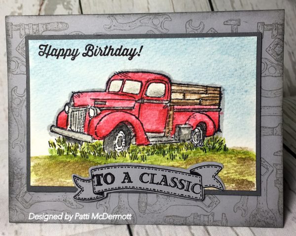
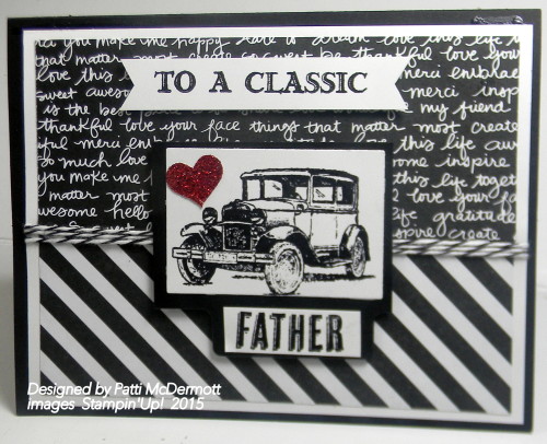
I love this new set with the vintage images. So cool. Here I used our classic inks with the aqua painter, page 180, and watercolor paper, page 175 to paint the classic truck. I used real Red, soft sky, soft suede, Wild Wasabi and old Olive inks. The card stock is Smokey Slate and stamped with same, using an image from Guy Greetings, page 114. What man wouldn’t love this card for his birthday? Banner is cut from the new Bunch of banner framelits, page 193.
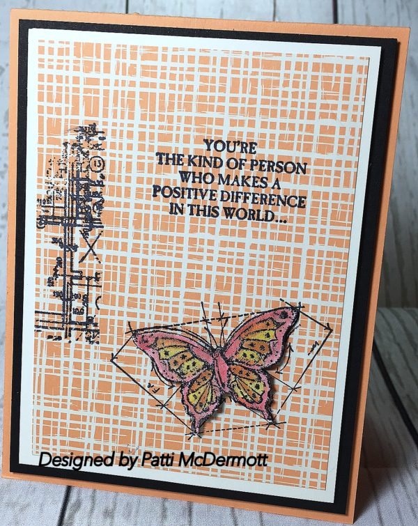
You can find this set on page 145. I love the sentiment on this card. On the inside of the card it reads …Especially in my life. I can never get enough of vintage and that is why I love this set. The DSP is from the 6″ X 6″ paper stack, Playful Palette, page 174. The colors I used on the butterfly were Daffodil Delight, Peekaboo Peach, and Flirty Flamingo. I did use the Wink of Stella clear pen, page 181, on the butterfly. Basic Black is layer after Very Vanilla on a Peekaboo Peach card base. I did fussy cut the butterfly. Hope you like it!
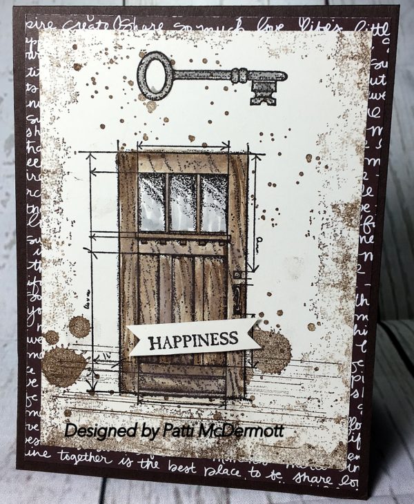
I guess by now you must know that I purchased all the vintage sets in the new catalog. I am so into vintage. Here I combined the sets, In This World, page 145, with Gorgeous Grunge, page 123. I used soft Suede, Early Espresso and Smokey slate inks. I used the Naturals DSP, 174, for the background on the base card. This is another great masculine card…….do you agree?
This is another hostess set that you can get if you have a party, your house or mine. This image is from the stamp set Pun Intended, page 200. This is one of those sets that are so versatile that you could go on forever creating with just this one set. Again great images and wonderful sentiments. I used the Thinlits Die, Sunburst, page 193, and the DSP is from the Pop Of Pink Series, page 172. I also used the gold foil paper, page 175, and the gold satin ribbon, page 178. What sets this card off is the new layering framelits, page 193 that contain interchangeable plain squares and scalloped squares. On this card I used both.

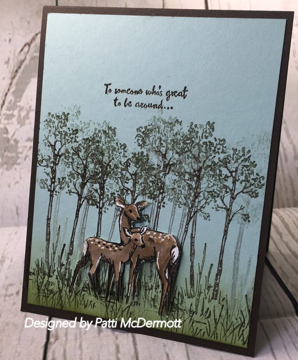
Here, I used the masking Technique to set the deer in front of the trees and stream. So easy to do. I plan on doing a video on this technique very soon. YES… you read it right, I am going to bite the bullet and start doing videos for you. Watch for them.
One of my favs. You might be surprised to know that I just purchased this set, even though it was featured in the Occasional catalog that just retired. When I saw that it was being carried over, I jumped for joy and couldn’t wait to get my hands on it. I know now I will have at least another year to play with it.
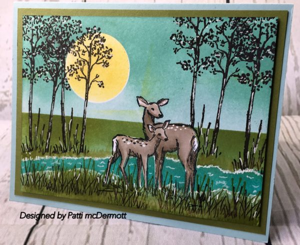
I created this card with the set, In the Meadow, page 129 in the AC. This set was carried over from the occasions catty and I am so glad. I used Always Artichoke, Early Espresso, Soft Suede and Crumb Cake on Soft Sky Card Stock. I did fussy cut the deer and I really like the way it turned out. I am so excited over our new catalog and if you don’t have one, contact me here.
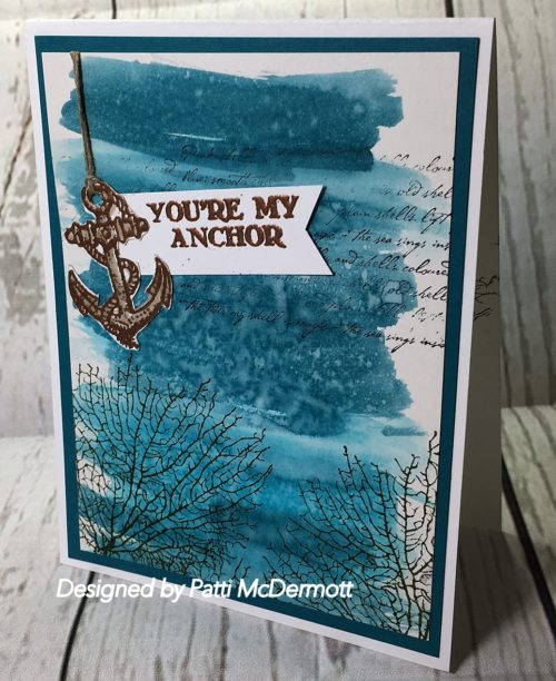
We made this card at my camp on Saturday for Father’s Day. I used the copper embossing powder on the Anchor and sentiment which are from the set, Guy Greetings carried over to the new catalog. The other images are from “By the tide,” which is being retired at the end of the month. In side the card we used the sentiments from the may Paper Pumpkin set that has all the different names if your are giving it to Brother, Son, Grandpa, etc. The technique I used on this card is the Watercolor wash on Shimmery Card Stock.
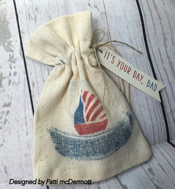
If you came to my camp yesterday, you would have made this as our 3D item for Dad, Son, Grandpa, Brother. Several choices to pick from. The sentiment is from this month’s Paper Pumpkin set. The images are from the stamp set, Swirly Bird, page 152 in the new AC. I used Real Red and Pacific Point on the muslin bags. These bags are being discontinued so if you want them, make sure you purchase them before the end of the month.
This is another masculine card made with the set, Going Global, page 30 of the OC. I used the DSP stack, Going Places, same page and the Metallic sequins page 160 of the AC. I loved the DSP from this suite so much that I bought 3 pks so you will be seeing this a lot. It is so versatile.
I created this card for our camp on Saturday and it is from the set Going Global, page 30 in the OC. I used the embossing folder, World Traveler Textured Impressions, same page, on the very vanilla background and I used the colors Delightful Dijon and Black Archival inks. The DSP is from the Going Places DSP paper Stack, also on same page.
I used this set By the Tide, page 82 with our Farmers Market DSP, page 143. Love that paper! The colors are so awesome. We are so fortunate to have beautiful papers, inks and embellishments that all match. You can intermix all different stamp sets with just about any of our DSPs.

This image is from the set The Wilderness Awaits, page 86. You know how I am always saying there are no mistakes in stamping? Well when I put this card together, I left a halo on the top of the sentiment and it looked messy. So I stamped it on another scrap piece of Very Vanilla and cut it out with the Decorative Label punch, page166. Now seriously, if I didn’t tell you, would you have guessed I screwed up? That’s what I love about stamping, you can always fix a screw up. I used a monochromatic style on this card and I think it makes a great card for a special man.

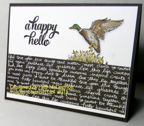
The Wilderness Awaits, page 86 is a fabulous set, perfect for masculine cards. Here I used the mallard in the set and combined it with our Neutrals DSP stack, page 144. I used Early Espresso for the card base. The sentiment is from the set Tins of Cards, page 110. This set is meant to go with Tin of Cards Project Kit, although I like the set even without doing the Kit Project. I have gotten so much use out of this set. I really like the font and thought it went really well with this card. Hope you like it too.
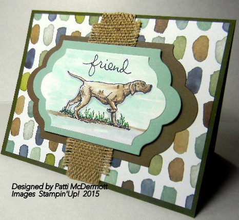
This stamp set can be found on page 86. I am so happy that SU decided to change around our Nature animals because I just love this set. I was getting a little tired of the noble Moose that they carried for so long. I especially love this Pointer. The next card I make with this beautiful animal I think I will incorporate the duck with it. I didn’t use watercolor paper on this, just our regular whisper white. I used pool party as the background with Crumb Cake and Sahara Sand for the pooch. The papers I used are Mossy Meadow, Mint Macaroon, Soft Suede and the DSP is English Garden, page 142. I also used our new Lots of Labels, page 173. They are so awesome!
This was another card we made at Wednesday morning club. I used the new DSP Neutrals collection and the stamp set, Guy Greetings found on page 98 of the new AC. After I completed the card I felt it needed a little something more so I added the heart punched out from the Red Glimmer paper, page 149. In addition, I used the Basic Black Bakers twine, page 158. The file tab was created using the file tabs Edgelits on page 172.
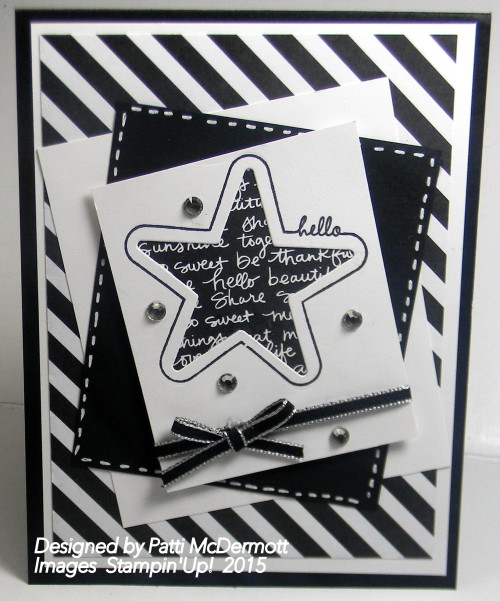
I love the new neutrals DSP stack. It is so awesome. These are a couple of designs from that new item. I love a black and white card. It is so sophisticated. I used the framelits from the Mini Treat bag. The stamps set is Your’re so sweet found on page 57 of the new AC. We made this at our Wednesday morning Club.
I got the idea for this card from one of the Artisan Design team members, although her name slips my mind right now. I changed it up a bit and I used the Birthday Bash Washi sheets, page 11 in the OC for the background base card. The other DSP that I used is from the very masculine series, Adventure Bound paper stack, found on page 40 in the OC. I know that it will retire so if you want some great masculine papers, this will do it. Stamp set is Guy Greetings, page 41.
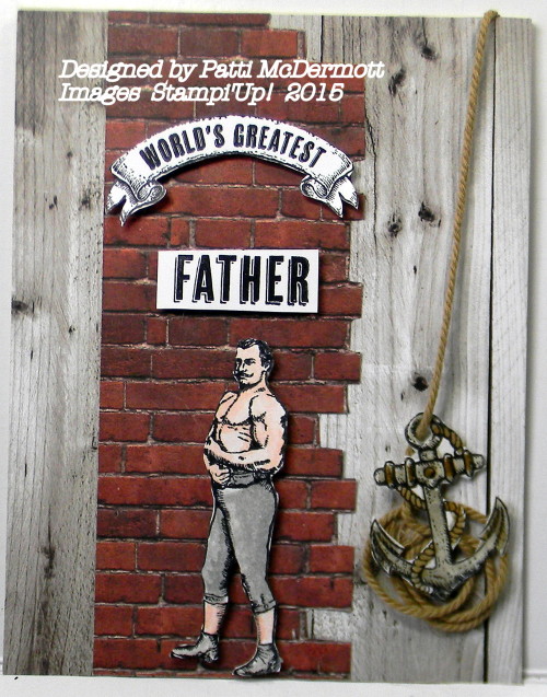
Had to throw in a masculine card with the in colors to show that even though they are soft colors they can be used for men. Here I used the set, Guy Greetings, page 41 in the OC, but soon to be carried over to the new AC. I am so happy for that because we need more masculine sets for the men in our lives.
You will see that I have used this set many times lately because of Fathers day that will be coming soon. I also used the set gorgeous grunge, page 165 in the AC, also to be carried over. Very excited over that too, because it has become a core set for me.

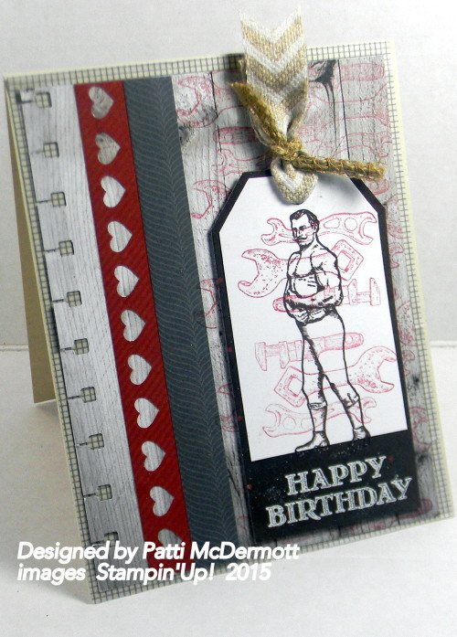
This is another card I created from the set, Guy Greetings found on page 41 of the OC. The sentiments in this set can be used for Father, Brother, Dad, Uncle, Grandpa, or Husband. You can do so much with the images because they are so awesome. I love a set that has both images and sentiments, takes all of the guess work out of creating. This can be either a Fathers Day card or a birthday card, or to tell that special man just how much you appreciate him. The DSP is from Adventure Bound, page 40.
You know how hard it is sometimes to come up with a Masculine card? Well, with this stamp set, Guy Greetings, page 41 of the OC, you can make several masculine cards for different occasions. The set is so versatile. I used the DSP from the Paper Stack, Adventure Bound, page 40. This is a wonderful assortment for that Masculine card. Stay tuned for more masculine cards to come.